York City FC’s redesigned crest pays homage to the club’s 100-year historyDesigner Christopher Payne has worked with the club and its fans to craft a special edition crest and kit for the side’s 100-year anniversary.
|
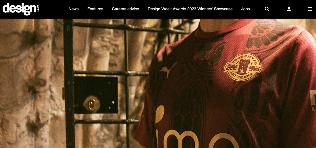
York City FC has revealed its centenary crest and limited edition kit, inspired by the stained glass windows at York Minster cathedral.
US-based graphic designer Christopher Payne has crafted the new look for the team, which plays in the National League North, the sixth tier of English football. The crest references the club’s 100-year history and will be used next season.
US-based graphic designer Christopher Payne has crafted the new look for the team, which plays in the National League North, the sixth tier of English football. The crest references the club’s 100-year history and will be used next season.
|
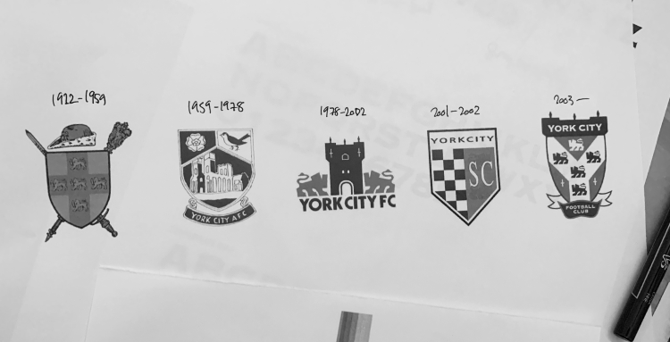
At the start of the design process, the club consulted with fans via an online survey about their favourite past badges and memorable design elements (such as the colours, typography and symbols). Payne also worked with club representatives, including the team’s historian, looking through past identities.
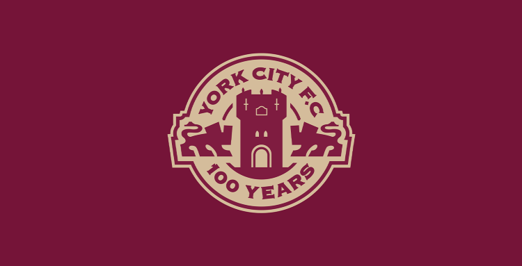
Over half of fans pinpointed the 1978-2002 crest as their favourite design, which depicts two lions facing Bootham Bar, a historic gateway in York. “I sensed that, in a city that’s not short on historic landmarks, Bootham Bar tower offered a potential pillar for the centenary crest,” Payne says. |
|
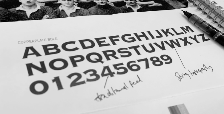
Payne also explored the club’s past typography, especially in the most recent crest which has a “strong, traditional, and very York City” feel, says Payne.
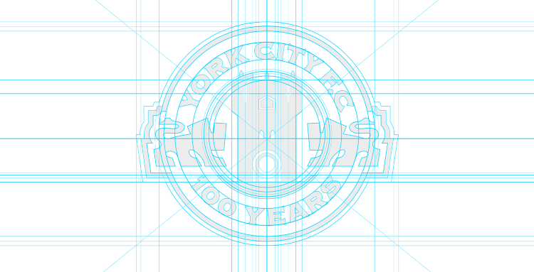
These elements have been incorporated into a circle as a way to represent a 100-year cycle and as a reference to the Pop Stand Clock (a clock which used to be housed at York FC’s old stadium), Payne explains. He positioned the typography around the crest, with the top section displaying the team’s name. |
|
The redesigned crest uses maroon (one of the club’s original colours) with gold tones which “add a touch of prestige”, says Payne.
After Payne had redesigned the crest, the club asked the designer to take a look at the special edition kits in collaboration with sports brand Puma. Initial ideas included having past players’ names on the shirts of headlines from famous results, Payne explains, but he eventually looked to York’s gothic cathedral to provide inspiration. |
|
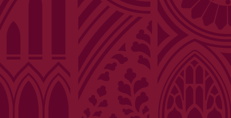
“There are so many intricate architectural features inside and outside of the cathedral,” Payne says, and he studied the stained glass windows and arched doors and placed the together to form an abstracted pattern. This process led to an “intricate gothic pattern” which Payne later formalised digitally – striving to make sure the familiar cathedral forms were seen and evenly distributed.
“Even though I wanted the kit’s pattern to be somewhat abstract, it was important that people from York would recognise the shape and structures from the Minster’s architecture,” adds Payne. |
|
Featured on the 2022/23 kit are details such as the circular rose window and the five sisters window – a stained glass section dedicated to the women who lost their lives during WWI.
The designs match the maroon crest, which is a change from York City’s usual red and blue kit. “I didn’t want the pattern to be too loud or contrasting,” Payne says, choosing a dark maroon and setting it against two varying maroon tones. |


